When iMac was released just over a year ago, the huge controversy was “why does it still have a chin?”
For months, everyone had said with how small the Apple Silicon’s board footprint and low power requirement could mean Apple could finally do away with the lower segment of the iMac.
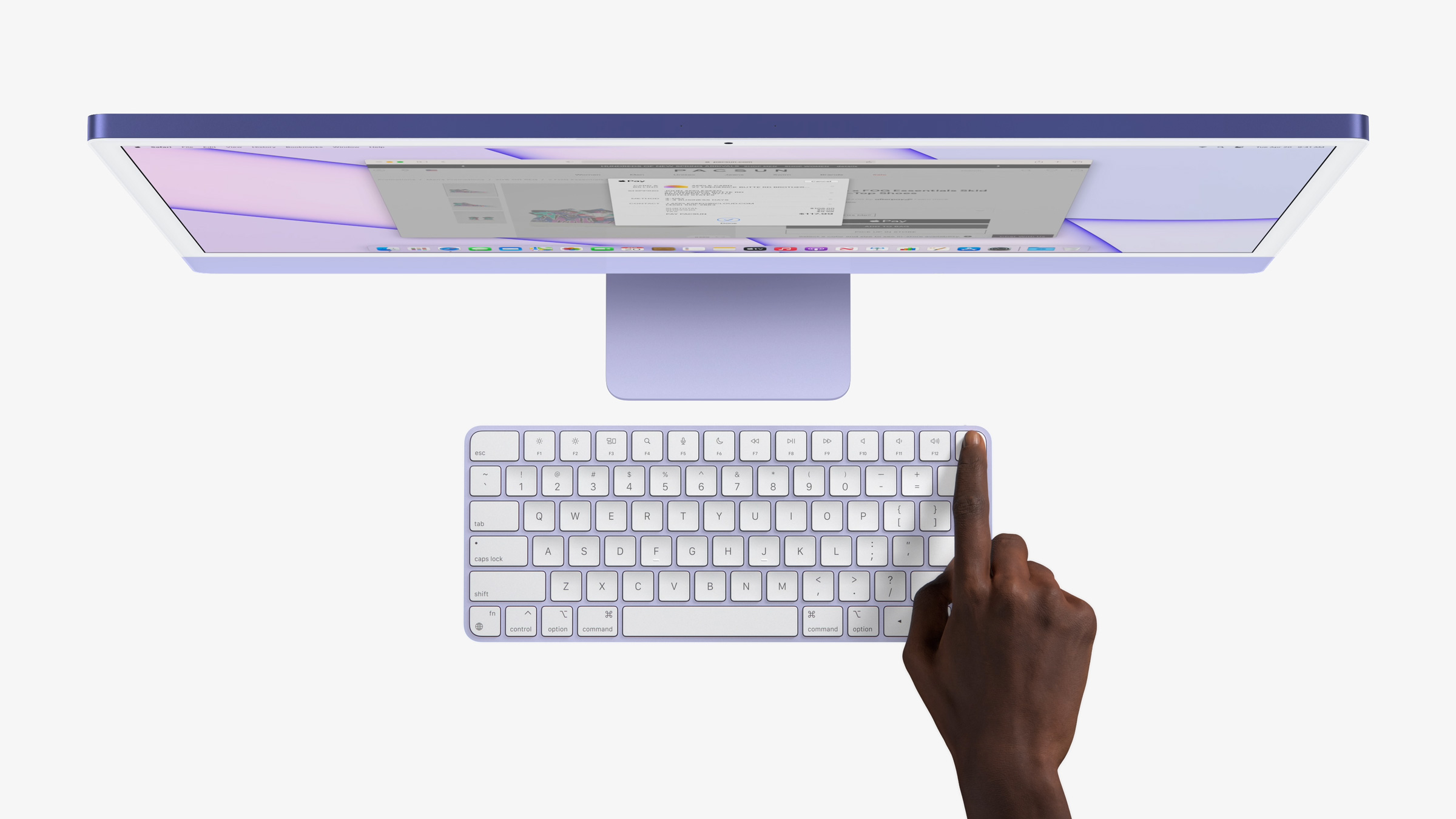
But while Apple took away the logo from the chin (yes, this was also controversial), they left that band of colour on the front. Everything about this design, somehow was controversial. From the colours being more subtle on the front to the off white bezels.

The iMac chin remaining though was probably the most confusing for people. There’s so much room in this design that the computer could easily be behind the display.
For me though, that “chin” is what has become iconic about the iMac itself. Apple no longer even needed their logo on it, for you to know that it’s an iMac.
Just as MacBook Pro no-longer says its name below the screen, rather forged into the base plate of the system, out of sight in normal use. The design now speaks for itself.
Even looking back to the original Macintosh, you can see the origins of this chin. There’s an even bezel which runs around the display, and then a line separating a chin. This is a part of what makes the computer look friendly, as if it has a face.
The colours reference back to the original iMac powered by G3, way back in the 1990s. The friendliness of the design remains, and it makes you want to get involved. It’s a perfect piece of design.
Check out the rest of Design Theory’s channel here.